Social Stamping – Pansies

June was a busy month for classes, my monthly card classes at home as well as Social Stamping at Taste of Dalyellup. I am taking a break during the month of July to rest and recharge my batteries. Social Stamping will start up again Term 3 from Monday 2 August.

If you are unsure if Social Stamping is for you, why not come along and give it a try? Bring a friend or two and enjoy a cuppa while making one or two gorgeous greeting cards. The choice is yours! I would love to see you from 2 August.

Last month, one of the cards we made was using the Pansy Petals Designer Series Paper. I used a layout from the catalogue to copy for this card while changing it slightly. I loved how this card turned out!

CASED card from the Annual 2021-2022 Catalogue

I used a piece of Soft Succulent card stock for the base of my card, this colour sure is becoming a favourite of mine. I am already onto my second pack! We used a blending brush with a mask from the Plenty of Patterns Decorative Masks set. The masks are a great useful tool in your craft room. You can use them to create awesome backgrounds with ink or embossing paste. Definitely worth a try if you haven’t tried them before.

I love the addition of the square vellum doilies for an added layer, they’re super light and thin so they add another layer easily without any extra bulk. The pansies and leaves have been die cut directly from the Designer Series Paper, I must say I do love it when the dies match the DSP! How super sweet are those little bumblebee embellishments?! Easily adhered to your card with a glue dots.

I am looking forward to my break from running classes in July, to recharge my batteries and to prepare for a busy term 3.

Until then I hope you all keep warm and I will see you in August!

Paper Adventures Team Hop out with the old

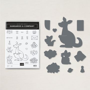
We are coming to the end of June which means saying goodbye to some products we have enjoyed from the January – June 2021 Mini Catalogue. So this month’s team blog hop is showcasing “out with the old” products that are about to retire on 30 June. I have enjoyed this catalogue, some products are sticking around in the new Annual 2021 – 2022 Catalogue but some products we have to say goodbye to. One of my favourites is retiring, the Kangaroo and Company Bundle. I think what instantly attracted me to the this bundle, is that it is Australian! I love that Stampin’ Up! being a US company includes us Australians in their product planning from time to time for their friends living down under. I think that’s pretty cool!

We recently used this bundle in my May card classes (yes I know I am way behind in my blogging!) I had previously made a valentines day/love card and a birthday card with this bundle (to view those cards click here) but this time I wanted to create a baby card.

KANGAROO & COMPANY BUNDLE
Kangaroo and Company Bundle – Retiring Soon

I used my favourite neutral colour for the card base, Sahara Sand teamed up with some in colour DSP in Pale Papaya. Usually I would stamp on Basic White card stock and colour in the stamped images with blends but I really wanted to show in my class that you don’t need a lot of products to make a pretty card! So I stamped memento black ink directly onto Crumb cake cardstock for my Mumma Roo and onto Sahara Sand for my Baby Roo. I coloured their ears and my Mumma Roo’s cheek with Dark Flirty Flamingo blend and a Crumbcake blend for their noses but this step wasn’t necessary. I do like how it turned out though!

I used the hearts stamp from the set stamped in Flirty Flamingo and coloured with a coordinating blend. These were then layered onto a die from the Scalloped Contours set which I have not stopped playing with since I bought it! I love this set of dies. So useful to have in your craft collection.

Everyone loves an interactive card of some sort, I have included the little tab with a love heart on the little Joey. How cute is it that this die cuts the pouch for the Joey to sit in! So cute, right?

A fun interactive element to this card by pulling the Joey out of the pouch.

I used the Banners Pick a Punch for the banner on the sentiment with some white twine for a sweet bow. I used the love heart die from the bundle to die cut 3 cute hearts in Sahara sand and a couple in Pale Papaya too.

A sweet little Joey and heart in the inside of the card.

If you are wanting to grab any last minute retiring products (some at sale prices!) you can head over to my website and get yourself some bargains before they are gone! While you are there, make sure you check out some of the amazing new annual catalogue products too! I have to say this Annual Catalogue is my favourite (shhh don’t tell anyone I always say that about every catalogue!)

Next up on the team blog hop is Kelly, I wonder what she has made to show us that she has been creating with. Make sure you click on the next button below to check it out and to see what other creations the rest of the team have made.

Happy Friday! Catch you next time.

Butterflies in a box

I am the first to admit I am not very consistent on the blogging scene. Sometimes I am on a roll, and blogging happens except other times I just kind of fall off the consistent wagon and I don’t get a chance to. I guess that is some indication of my crazy busy life, we all know what that is like, right?

I found some time today to sit and finally log into my blog to show you a beautiful project I recently made for a friend’s 50th birthday. I loved creating this card so much that I decided to use this in my May card class as our fancy fold. My monthly card classes include three cards usually one of them is a fancy fold.

I used two of the new 2021-2023 in colours, Evening Evergreen and Soft Succulent with the Pansy Petals DSP. This paper is just so gorgeous, I thought it was the perfect choice to go with my butterflies. I used Pale Papaya, Fresh Freesia, Mint Macaron, Pool Party, Polished Pink and So Saffron blends to add colour to my butterflies.

Butterflies are adhered using glue dots and strips of window sheet.

Some small strips of window sheet and glue dots makes it easy to layer the butterflies into position. What I love about this style of a card is not only is it 3D impressive, it is also able to fold flat into an envelope! Ready to pop into the post.

Card folds flat ready to pop into the post.

You might be wondering, “but where do you write on this card?” I also have that covered. On the back is a section where you can write your message.

Back view of card where you write your message.

Despite first looks, this card is quite simple to make. Some great instructions can be viewed on Di Barnes blog if you click here. I do hope you will give this fancy fold a try. I would love to see what you make! It is so much fun watching it come together. One of my new class members was totally wowed by the cards we made. Remember that feeling when you first stamped that first stamp or cut that first die cut? I remember that totally awesome feeling! It is so so much fun and I would love to see you join me at my next class, message me for details.

On the blogging front, I will try to keep blogging when I can, life doesn’t seem to be slowing down anytime soon. If you read my blog and want me to blog more, let me know! I am always more encouraged to do something when I get engagement. I love reading your comments.

My craft desk looks way too tidy and lonely for my liking today so I best get back to designing for the next lot of classes.

I hope the week includes something fun for you too!

Treasured Medallion

At last month’s card class, we used one of the hidden treasures in the January to June 2021 Mini Catalogue. A cling stamp set with such detail that stamps beautifully. This stamp set is perfectly used with lots of different techniques. For my class, I decided on the resist embossing technique.

We stamped the large mandala in versamark and heat embossed using clear powder. Misty Moonlight, Highland Heather and Coastal Cabana were my chosen colours because I just love them together! Sponge daubers were used to softly add colour using a circular motion. I like to add colour gently, you can always add colour but if you go too dark at the beginning, you have no way to take the colour off.

Splatters of colour were added using Stampin’ Up Markers

We added some extra interest to the background of the card, adding splatters of colour. This is a cool way to add colour to your card. I used the large tip end of the Stampin’ Write Markers in Misty Moonlight and Coastal Cabana. I simply take the large end and flick it on the inside of the marker lid. Flicking it towards your card will put random splatters of colour on your background. A simple thing to do, love it or leave it but I choose to love it!

The sentiment, you are a treasure, was heat embossed in white on Misty Moonlight cardstock and cut using the Treasured Tags Pick a Punch. This awesome punch comes with 2 end options and will cut widths 1/2″, 3/4″ and 1″. This punch can be purchased on it’s own or bundle it with this stamp set to get 10% off.

I used this stamp set again for a birthday card but using a different technique.

Lately I have been having fun with the Stampin’ Blends and Isopropyl alcohol from Bunnings. If you haven’t already seen it, make sure you check out my previous blog using this technique. It is heaps of fun and I love the unpredictable nature of what your project will end up looking like. I used Misty Moonlight, Highland Heather and Just Jade blends here. I seem to be in a Highland Heather mood lately! I used these colour blends to colour onto vellum before spraying some isopropyl alcohol. When it was dry (which doesn’t take long), I heat embossed some gold on the vellum using the mandala stamp. I was hoping for a sunny day to make this shine in the photo but unfortunately, the sun forgot to get out of bed here today and this was the best I could do!

I hope that inspires you to use the Treasured Medallion stamp set. I am off to a craft retreat this weekend and I will be taking this stamp set with me. I love it when you find something you just love creating with.

Hope your weekend is a fun one, I am excited about a 2 night getaway to not have to plan dinners or wash everyone’s dishes or clothes. I can just craft to my hearts content for the whole weekend! Ahhh bliss!

Stampin’ Up! 2021-2023 In Colors

The new Stampin’ Up! Annual Catalogue is about to launch tomorrow on 4 May and with the new catalogue come 5 new in colours for the 2021-2023 period. I was able to order these in colours earlier in April (demonstrator perk) and I must say I am loving these new colours!

Note cards are the perfect size for cute thank you cards

These cards were made using the note cards and envelopes to make some pretty thank you cards. I am really loving my new Colors and Contours bundle I grabbed on the pre order list last month. The dies in this set are AMAZING! If you love anything with a stitched edge, the dies in this bundle will not disappoint! Click here to check out another card that I used one of the dies for earlier this month.

To make these quick easy cards I used one of the new in colours per card. The new colours are Fresh Freesia, Soft Succulent, Polished Pink, Pale Papaya and Evening Evergreen (featured from left to right in the above photo). A strip of the in color designer series paper, some stamping of the flowers in the corresponding colour, with a white heat embossing sentiment and some of the new in color jewels.

I know what you are thinking, flowers aren’t green! While I know that they aren’t I still love how these cards turned out. That is the beauty of crafting. You can decide on what colours you choose!

Each card came with a matching envelope flap.

One thing I absolutely love about note cards and envelopes is that I can decorate the flap of the envelope with a piece of 6″ x 6″ DSP and it fits! The reason I love this is being in Australia, our envelopes are a different size to the US sizes and we can’t use a piece of 6″ x 6″ DSP to cover the flap of our envelopes as they are too big! But I always get excited when I can do this to one of our note card envelopes. It is the small things in life that get me excited lol.

Cute little bookmarks showcasing the new in colors.

Aren’t these colours just gorgeous? What is your favourite colour? These thank you cards and bookmarks were sent out to customers with a copy of the new Annual Catalogue last week.

I am super excited about this catalogue (I say that about every catalogue!). There is something special about getting a new catalogue, the same feeling I get when I get a new notebook or a new pen haha!

Today at Social Stamping, we made another card using the in colours and the Colors and Contours Bundle. For this card, I took my inspiration from another demonstrator Jen Jaw Floyd. I don’t think she has a blog or anything that I can link to her, but I still wanted to mention her name.

I used 1/2″ strips of the in color DSP layered a piece of white die cut with one of the dies from the bundle. I die cut some basic white with one of the scalloped dies from the Scalloped Contours and then embossed it using the Painted Texture 3D embossing folder.

Three flowers were stamped in Polished Pink, Pale Papaya and Fresh Freesia. A sentiment I decided is perfect for Mother’s Day, Mother’s are amazing!

So tell me, do you have a favourite in colour yet? Which one is your favourite. For me, I am loving the tones of them all, I think Soft Succulent is winning the race so far.

I hope that you will enjoy all the new products on offer in the new annual catalogue. If you want to get your hands on a hard copy, get in contact and I can send one to you!